FIRST: Stephen James Taylor's long awaited website featuring his film about Erv Wilson is now up and running. Here's the URL: http://www.thesonicsky.com/
AND, back in September, on John Schaefer's NEW SOUNDS program on WNYC, New York, there was a show featuring the Australian ensemble Topology, as well as music by Vincent Plush, William Duckworth, and myself. The music is delightful, and the program has a nice sequencing. Well worth streaming for your late night listening pleasure. Again, the URL: http://www.wnyc.org/shows/newsounds/2011/sep/06/
Life has been busy, but I've finally processed the video of my live performance "The Bird Is The Word" at the 2011 Australasian Computer Music Conference in Auckland on July 6. Here it is, and thanks to John Coulter for providing the performance video. A more lengthy description of "The Bird is the Word" can be found a few blog entries ago. Or to go to it now, click HERE.
ALSO, I've just posted my review of the 2011 ACMC - it took months to write - but it's here at last. You can link to it HERE, or download a pdf for ease of reading HERE.
It’s been a while since I’ve posted things. As usual, I’ve been busy. But I’ve been preparing things for the website – it was just a matter of robbing enough time from other commitments in order to be able to post things. Here are 5 new posts, with 5 new pieces for your reading and listening pleasure.
Jacques Soddell has been organizing the Undue Noise performance series in Bendigo and Castlemaine for the past several years. When we moved to this area, he soon got into contact with us, and asked if we’d like to be involved. We (Catherine and I) were delighted to be asked, but my very demanding teaching and commuting schedule worked against us doing things, so far. Then in early August, Jacques asked us if we’d like to be part of an improvisation evening he was organizing at the Old Fire Station, which is a lovely Black Box theatre in, not surprisingly, the Old Fire Station next to the Capital Theatre and the Bendigo Art Gallery. The timing was perfect – I am currently working at Bendigo TAFE on Saturdays, and finish work at 5pm. The concert was at 8 pm. There would be time to set up and have a nice meal before performing.
Catherine has 6 Sruti Boxes, Indian drone harmoniums. There are three pairs, one each tuned to a B, C and C# fundamental, with each pair having a slightly different tuning. These were custom made for her. I was using my netbook using the Cakewalk Dimension Pro synthesizer with tones I’d made myself, where the harmonics of the sounds were tuned to the sub-harmonic series, using prime numbered sub-harmonics from 17 on down. Four different versions of each timbre were made (using the additive synthesis features in Cool Edit Pro), and in performance, using two sliders on my Korg NanoKontrol, I can fade between each of these timbres, making any combination of them. This made tones where the spectrum was a bit unstable and dissonant, but always changing. I only played these tones at 12 different pitch levels, which again, were the 12 prime numbered sub-harmonics starting on 17.
In performance, Catherine is continually changing which Sruti Boxes she is using, and which pitches are playing on which Box. I’m slowly changing which pitch or pitches I’m playing (pitches are triggered off by on-off buttons, not by a keyboard), adjusting the timbre, and also changing the overall volume, adjusting the balance between Srutis and Electronics.
The performance went very well. We, and the audience, were very pleased. Jacques had recorded our performance, and on listening back, we thought it was good enough to share with friends in web-land. On listening back, Catherine said that the cross fading of different harmonic textures that happens continually in the piece was similar to the idea that animated her making her 30 meter long graphic score, “Blue Line.” For those of you unfamiliar with that score, here are a few photos from the 2009 performance of it with Speak Percussion (Eugene Ughetti, Matthias Schack-Arnott, and Leah Scholes) as part of the “Catherine Schieve: Graphic Music” concert at the Melbourne Recital Centre.
(Photo credits: Siri Hayes, Catherine Schieve)
So our piece for Sruti Boxes and Electronics is now called “The Idea of Blue Line.” Here’s the recording of it, for streaming and downloading, in mp3 and ogg. Many thanks to Jacques Soddell for inviting us to play, making the recording, and then sending it to us so promptly. Enjoy.
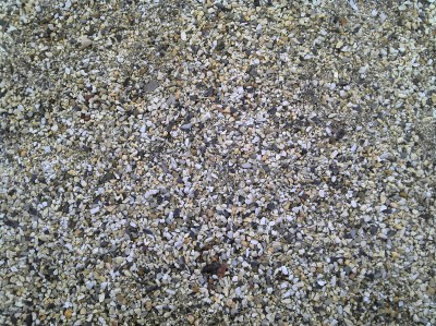
Of late, I’ve been seeing patterns in the world around me which I’ve thought would make good scores for graphics to sound conversion. A number of those pieces are documented in this blog, most recently “Berries”, Mike Cooper’s Shirt, and a graphics and sound piece for Kenneth Gaburo. Well, this is clearly getting out of hand. I mean, I'm now seeing good music patterns just about everywhere. About two weeks ago, I was walking from the train to Bendigo TAFE, my other employer, and just across the street from the campus, there were some gravel patches next to the sidewalk. In the morning light they looked quite appealing, so out came the cell phone, and I took a couple of shots. About a week passed before I could finally begin to find out if the pictures of gravel had any potential to make a sound score.
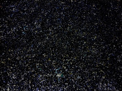
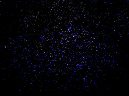
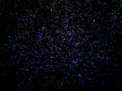
As you can see, the picture is fairly uniform, but the variety of shapes is quite attractive. I thought that perhaps this might make a texture of little grains of noise – perhaps a noise-scape, to contrast with the sine-wave pseudo-additive-synthesis sounds of “Berries.” The first step, as always, was to get some black in the background. Three different treatments were made, and I tried converting all of them to sound.
Visually, I liked the first treatment best. To do the conversion, I was using Coagula, which uses colours from Red-Green to determine position in stereo space for each sound, and Blue for the amount of band-limited noise to have in each sound. No Blue = Sine Wave; All Blue = All Noise. But when I converted the first picture to sound, it made a fairly unrelenting, undifferentiated noiseband. The third treatment was more promising, and is also fairly visually appealing, but it too seemed to make sound that, while more differentiated than the first picture, was also very heavily weighted to being “just” a noiseband. The second treatment, although not as visually appealing as the other two, produced a much wider variety of sound-type – starting with a mix of tones, burbles, and small noises at the start, through to rushing noises dominating the middle, and settling down to a mix of sound types near the end.
Settling on a duration for the realization was an interesting quest. When the picture was realized as a 30 second burst of sound, it was mostly a burbling texture:
Stretching the duration to 5 minutes produced a more differentiated texture, but the progression of sound types seemed too rapid and the rhythm too rigid:
With the duration set to 10 minutes, the speed of reading the individual pixels became almost a pulse oriented beat. My dance-music colleagues might find this one useful, but I didn’t.
A duration of 30 minutes seemed to slow things down to the point where individual textures and noises could be appreciated and even savoured. But over the course of 30 minutes, the rhythm, for obvious reasons, began to appear a bit “samey.”
I then made a 25 minute version, which was just a little bit faster (6/5ths faster, if you want to be technical). Mixing the two versions together made a texture that was too busy, but cross fading from one version to the other produced a very pleasing sense of the texture getting faster and slower in the long time-scale, while still giving the variety of sound-types I found appealing, and it also preserved the dramatic sweep of the piece from a mix of small sounds and noises to a roaring noise-band, and then back again.
The problem with doing this was that what at first seemed like a whim – “That looks neat – let’s photograph that and see what it sounds like!” - turned into a many hours long task of listening to sound after sound, again and again, until finally arriving at what I think is a good sound-structure. Most of this listening took place late at night, under headphones. I think I slept through a lot of it. Sub-conscious perception, anyone?
In any case, here’s the result – a companion piece for “Berries.” This one is called “Gravel.” The two of them together fill an hour – they might make a good concert, or an installation, if I can ever find the time to organize an event like that. Meanwhile, in the world of streaming audio and downloads, you can download both, or listen to both on line, and make your own situation for listening to them.
As usual, you can stream the piece below, or download it in mp3 or ogg (higher fidelity) formats.
Back around March, when I learned that the theme of this year’s Australasian Computer Music Conference, to be held in Auckland in July, was “Organicism in Electro-acoustic Music,” I decided to make a piece with all bird, or bird-like, sounds. I was involved in the ongoing beta-testing of Richard Orton and Archer Endrich's Process Pack, so I decided to start with bird song and see what sounds I could get with that software. Looking through my collection of bird samples, I chose three Australian birds (Magpie, Tawny Frogmouth (which I had recorded outside our window when we lived in Kanahooka NSW), and Rainbow Lorikeet), two Brazilian birds (Uirapuru, Toucan) and one Antarctic bird (the Emperor Penguin).
I chose the bird samples pretty quickly – I wasn't too particular about which birds I used, but I quickly realised I wanted a sound with more bass or depth than most birds. Even the Emperor Penguin didn't have enough of that for me. Where, I wondered, could I get a recording of a BIG bird? Besides Sesame Street, that is.
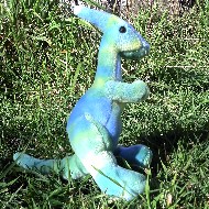
I remembered that back in 2002, when I was in Urbana, Illinois, Anthony Ptak and I had made a fun trip up to Chicago to the Field Museum to record their Parasauralophus simulation. The Parasauralophus was the Cretaceous dinosaur with the long crest on the back of its head. Examinations of the skeletons have shown how their breathing mechanism extended up, thorough and around their crest. Their vocal track was several meters long. The Field Museum had constructed a pair of “lungs” that you could squeeze, and the pressure from those went through curved pipe of the same length and diameter as the vocal tract of one of the skeletons. Depending on how you squeezed this, you could get anything from gutteral grunts to extended sliding wails. Since current thought is that these were pack animals who used sound for communication, the Cretaceous must have been a very lively and noisy place. In our time at the museum, we recorded about 20 minutes of different kinds of dino sounds.
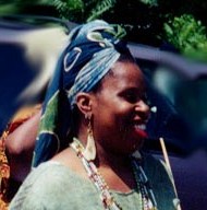
I don't know what Anthony did with his samples, but I used mine later that year in a performance in Albany, NY, with performance poets Lori Anderson Moseman and Druis Beasley, entitled “Bog Girl and Mud Womyn.” Here are some links to their current websites and work:
Pictured: Lori Anderson Moseman (top), Druis Beasley (middle), Perry Parasauralophus, who followed me home from the Field Museum and has been cheering up the place ever since (bottom).
So back to the sample vault I went. The Parasauralophus sounds were indeed very good material, and so one of those, along with the other six bird sounds were the source materials. Four of the resources of Process Pack were used on the original sounds: Filter Bank, Hover, Pyramid, and Wraith. I used Filterbank to create suspended chords with the original sounds softly present underneath them. With Hover, I drew all the “control curves” used in the process by hand, fragmenting the original sounds in ways that sometimes resembled the original sounds, and sometimes were quite abstracted. Pyramid stacked the Hover sounds into chords of the same sample played at many different speeds. Wraith extracted only a few harmonics out of the spectrum of the treated sounds. Additionally, I used PaulStretch to time-stretch the Wraith sounds. The Filterbank and Wraith sounds were smooth and pitch oriented, while the Hover and Pyramid sounds were noisy and agitatedly textured.
With 7 original bird calls, (assuming that a dinosaur, even a virtual one, is a bird relative), and 4 processes, this gave me a vocabulary of 28 sounds to work with. To play these, I used the same Plogue-Bidule sound-mixing patch I'd developed last year for “Texan Stretches” but changed the transposition possibilities for the sounds as I was mixing them. There were four different sample players. Each had all 28 samples available. As the transposition of each sample was different on each sample player, any of the samples could be played in four different versions at once, making chords and polyrhythms drawn from five different pitch possibilities (the original and four different transpositions).
For the transposition pitches, I used a scale that Jacky Ligon had sent me – a non-octave Pythagorean-type scale in which phi was the generator (1.618/1 = approximately 833.09 cents) and in which phi raised to the power of phi (2.178/1 = approximately 1347.968 cents) was the period, or fold-over point.
(Technical tuning note: In a normal Pythagorean scale, you stack up copies of a single interval (in this case 833.09 cents), and if the resulting interval is more than an octave, you lower the resulting pitch an octave. In this scale, instead of “folding over” the intervals at an octave (1200 cents), we fold them over at 1347.968 cents. Scales of 5, 8, 13, and 21 notes made in this way exhibit Moment of Symmetry properties. If anyone wants a further explanation, they should write me directly with the Contact form on this website. If enough people contact me, I’ll write a small blog post explaining the matter more thoroughly.).
The original sounds already had a sense of pitch about them – the scale was used to make further transpositions of these sounds. With the addition of these transposition possibilities, I now had far more sound resources than I could possibly mix and play with in any individual performance. Since I value unpredictability in performance, this meant that each performance, even if it followed the same general form, would be different.
I envisioned each performance as being around 10 minutes long, and the first performance, at Box Hill Institute, on a Faculty afternoon recital in May, was about that length. In later rehearsals in my studio, the length of a performance seemed to stretch out to 12 minutes, and that was also the duration of the performance I gave (the first one which incorporated the Phi-scale transpositions) at the Australasian Computer Music Conference at the University of Auckland, on July 6. (That performance was on a lunchtime concert. This piece seems to be evolving as a mid-day raga!)
Finally, in early August, I sat down to make a good studio recording of the piece. I decided that rather than adopt the strategies I'd used for making shorter performances at Box Hill and Auckland, I'd just play away, letting the sounds take their own time, finding out how long that process would be. The completed recording was 23:40, and when I listened back, I was delighted with the pace of the performing. Now the sounds seemed to breathe. The progression from smooth pitched sounds to noisy textures and back to pitch didn't seem forced to me, either. I enjoyed hearing different families of sounds (modified magpies, for example) as the appeared and reappeared in the piece in different guises.
The performance at the University of Auckland was also videoed. That is now available at this address. For those who want to hear the longer one, here's the 23:40 version of “The Bird is the Word,” in streaming form, and downloadable in mp3 and ogg (higher fidelity) formats.


 Warren